Keel is a tool that audits design systems. Keel’s own surface is built from a design system — foundations, components, and theming decided before the first screen was drawn. This page is the reference. Every token and component shown below is the source of truth for what ships in the product.
The tokens everything else is built from.
Keel’s foundation is narrow on purpose. Nine surface colors, three text weights, one accent, three severity tones. Narrow foundations make violations visible — which is Keel’s job.
Color
Surfaces, text, accent, severity
The page is grayscale because it is a review log. Dark blue marks decision moments (accept, approve, pending, ship). Severity colors belong to drift-severity only — nothing else in the product earns red, orange, or yellow.
Surfaces
Text hierarchy
Accent (decision)
Severity (drift only)
Typography
Mono for facts. Body for claims. Display for moments.
Three families. Mono carries everything the system knows to be true: tokens, filenames, timestamps, severities. Body carries rhetoric: claims, descriptions, copy. Display is reserved for page-level typographic moments.
Display / 3rem
3rem
Every surface answers one question at a glance.
Display / 1.5rem
1.5rem
Section heading
Body / 1.0625rem
1.0625rem
Keel watches AI-generated pull requests against your design system.
Body / 0.875rem
0.875rem
Supporting text for labels, captions, table cells.
Mono / 0.8125rem
0.8125rem
Textarea.tsx — input-border — 3h ago
Mono / 0.625rem
0.625rem
EYEBROW / LABEL / METRIC LABEL
Spacing
4-based scale. No p-7.
Six values. Anything else is a violation — one of the three categories Keel’s parity checker flags on AI output.
Radii
Four sizes for four roles
sm for inline pills and chips. md for buttons and inputs. lg for cards and panels. xl for hero-scale surfaces.
sm
4px
md
8px
lg
12px
xl
16px
12 components. 5 subsystems. One system.
Every component was designed to carry a specific kind of information. Severity badges never mean anything except drift severity. Inline code pills carry literal identifiers from the codebase. The accent color only appears on things the user is about to decide on.
Actions
Buttons, icon buttons, decision bar
Primary button
Black fill, subtle border, icon-first. Used for the one primary action on a view — never two at once.
Icon buttons
Unstyled except at hover. Used for theme toggle, settings, row actions — never for destructive work.
Decision bar
Two buttons. Primary action in accent. Secondary reject in ghost. Never stacked, never three.
Segmented control (trust levels)
Three options, one axis, always in order of increasing trust. Policy config uses one per action row.
Status & data display
Badges, pills, code, avatars
Severity badge
Dot + label. The three colors are the entire severity palette. No other component borrows these hues.
Status pill
Short uppercase mono. Used on parity results, policy decisions, timeline states.
Inline code pill
Two variants. Neutral for filenames and known-good tokens. Accented for the token at the center of a drift.
Textarea.tsx references input-borderAvatar chip
Initials circle + name + email. Accent-filled circle — the only place in the product an avatar earns color.
Severity distribution bar
Proportional segments in severity colors. Dashboard-level read at a glance — how is drift distributed this week?
Active drift by severity
Health score
Display-size number, mono denominator, single delta line. The dashboard's one hero metric.
System health
↓ 4 from last week
Tables & filters
The core data surface
Table row
Severity, issue text with inline code, timestamp. 48px row height is non-negotiable — fifteen rows fit above the fold.
Filter trigger
Label + caret. The options dropdown uses the popover pattern below. No full modals for filters, ever.
Containers
Popovers, not modals
Keel has zero blocking modals. Anchored popovers carry settings, filters, row actions. A blocking modal in a review tool is an interruption to the reviewer’s scan — and the scan is the job.
Settings popover — light
Sectioned dropdown (Account · Workspace · Session). Accent avatar, SOON chips for not-yet-shipped entries, mono shortcut affordances.
Settings popover — dark
Identical IA, reinforced contrast. Section dividers slightly brightened for dark-mode legibility.
Light and dark are the same system, not two systems.
Every token has a light and dark value. Every component renders the same information architecture in both. The theme toggle is a lookup swap, not a re-skin — if a component looks materially different across modes, the component is wrong, not the theme.
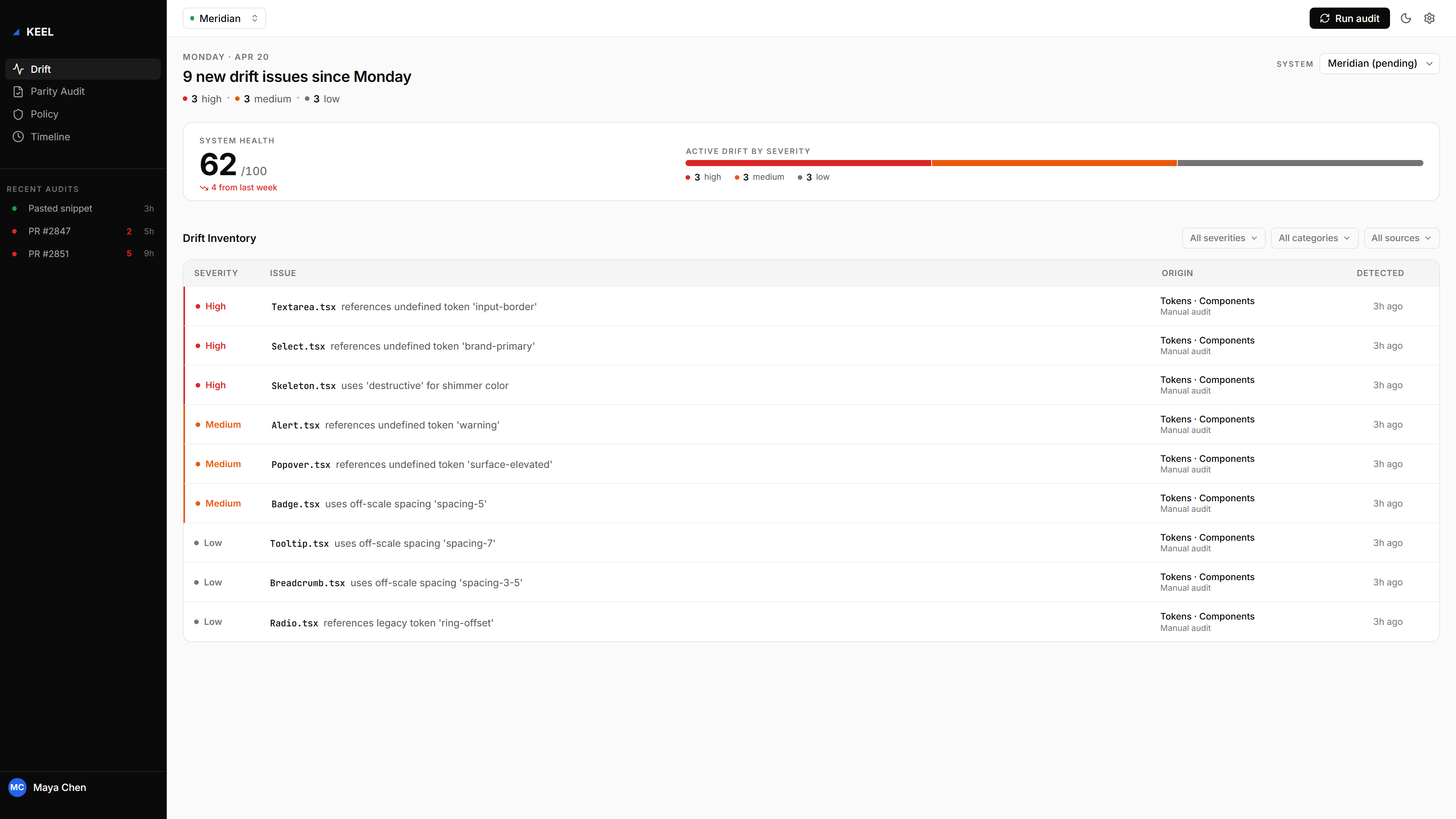
Drift dashboard — light
The same rows, same hierarchy, same severities. Surfaces brighten; severity hues shift one step darker to preserve contrast.
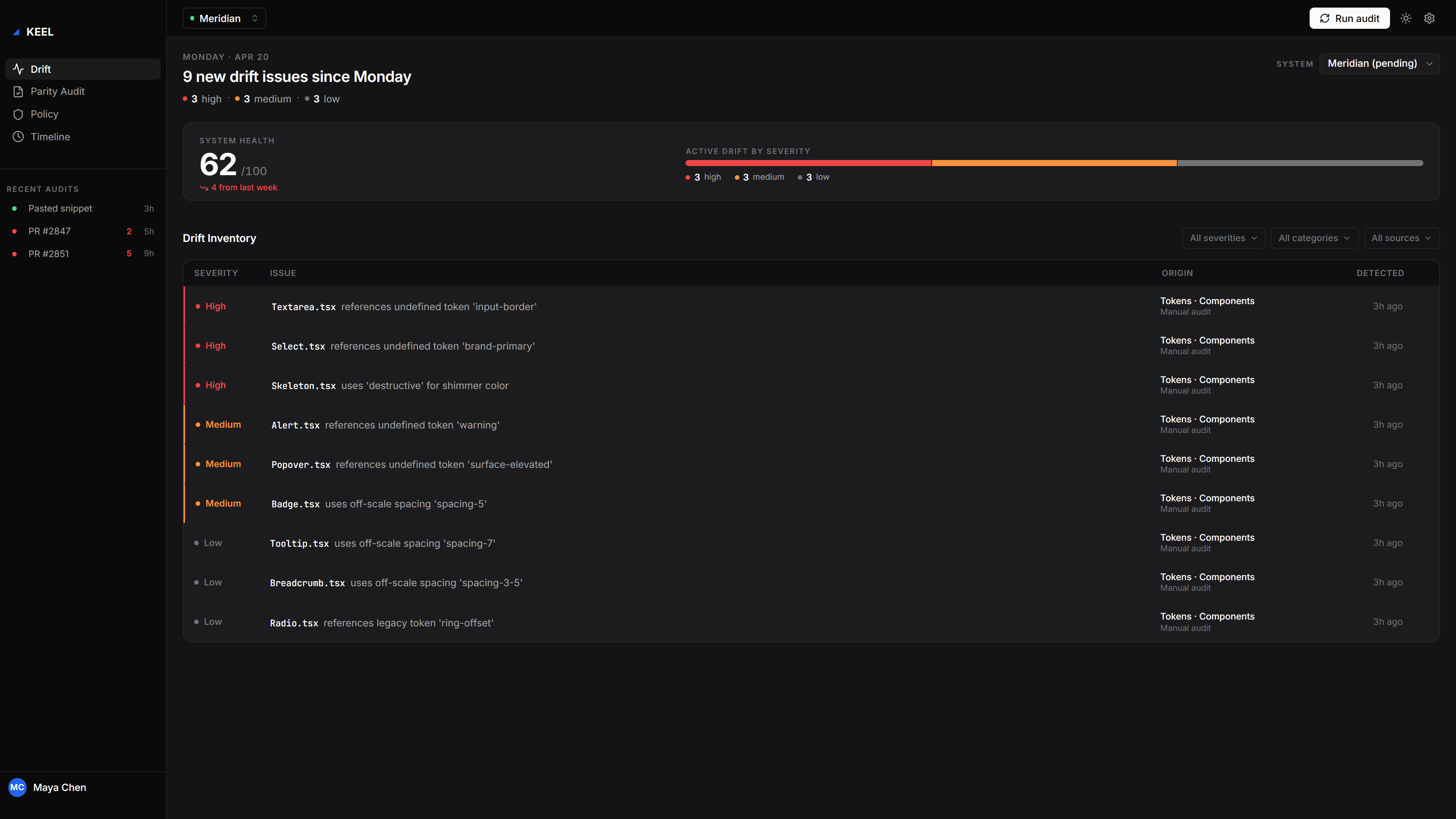
Drift dashboard — dark
Dark-mode parity. Same dense layout, same ten-rows-before-scroll rule. Every component here earns its dark treatment from a token, not a stylesheet.
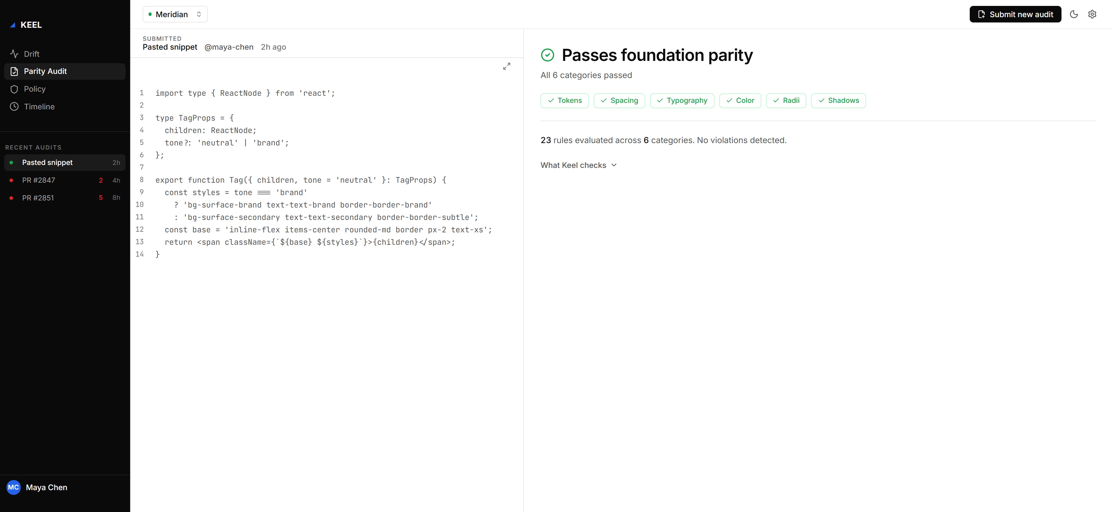
Parity audit — light
Pass-state auditing. Green fill-at-low-opacity signals a clean run. No severity hues appear when there is nothing to flag.
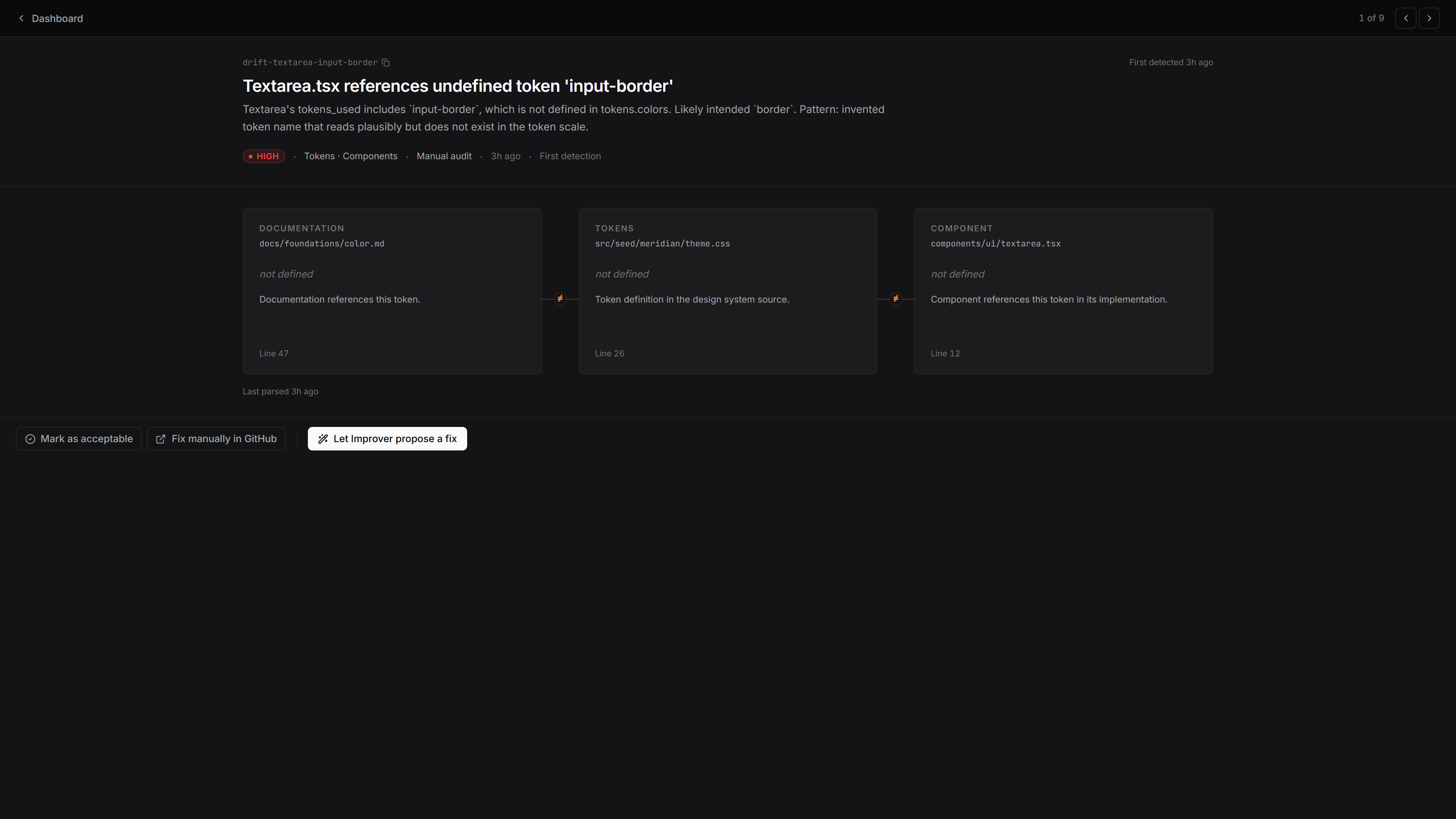
Parity audit — dark
Five violations on an AI-authored PR. Severity colors only activate when the foundation rules disagree with what was shipped.
Back to case study
Keel
Governance for AI-Authored Design Systems